Cuong Dieu

Advance Photography Studio (AD530) course at NYCCT/CUNY

Sunday, December 03, 2006

Bird eye view at Top Of The Rock


This final project is really challenging me because of the weather and lighting. This is winter time and everything like freezing all day long especially after sun set. I feel the cold and my hand start to freeze. Therefore, it is hard to press all buttons. Another thing is the windy weather to blow up my slow shutter speed. This cause motion blur in my final composition at 30s long. I saw my tripod shaking and shaking........

Monday, November 27, 2006

Annie Leibovitz

After seeing Annie Leibovitz’s exhibition about her personal and commercial photography, the show gave me a great impression about her works. I really love the way she professionally portrait people. About the set up in the gallery, the two walls of thumbnails in specialized personal and commercial works are genius to separate two big categories. I have never seen this before and it gave me the entire body Leibovitz’s photography during this period 1990-2005. According her biography film document, she loves to travel from state to state. She has a chance to meet lots of famous people and portrait them. She’s single parent with three kids. If other students read my review about Leibovitz’s photography, portrait is the main category that she wants us to memory. Portrait photography should be taken in door or out door with color or black and white.
This exhibition focuses on portrait photography with both commercial and personal works. Let talk about her personal photography first, I noticed almost her works is in black and white except photographs of her first daughter are in color. Why are black and white? It’s traditional, personal, and expressional of her family and closed friend, and she portraits them to record the moment. The lost of her father and Susan is a big grief. But she’s able to capture in Black and white photos which may be black white photos has less impact than color photography. The birth of her daughter is very joyful that she photographs in color to reveal happiness. In the commercial photography, the color is dominated in this category. The way use of color is very vivid and saturated. The counter, detail and gesture of the subject are revealing and lively. Both personal and commercial works are added from one to another. Because both categories showed that she’s a master lighting in black and white and color. One photograph about her mother’s portrait is wonderful facial expression in black and white. This is a formal portrait outdoor which the subject is at home garden. This photograph is used rule of third to emphasis of her face with great shadow depth of field. Her wrinkles are detailed to show her elderly. Another commercial photograph is Demi Moore. This photograph reminded me the magazine cover of Britney Spears. Again this picture is used the rule of third. Leibovitz exposed her body with child that this photograph is very feminist.
Both photographs above show Leibovitz is the master of lighting whether indoor or outdoor. She has the ability to record great portrait at that moment to reveal expression. No matter in black and white or color, she still make a good composition using the rule of third.
The exhibition impressed me is the way she shooting lots of famous people in political party and Hollywood. I’ve never seen any photographer like her. She’s very dynamic and creative. I really want to see more color photos in her personal work. The audience should be male and female with the age of thirteen and above. This is a great show which would expand my knowledge about portrait photography.

Monday, November 20, 2006

Final Project

When I think about to do this project, I have a lots of ideas what I’m going to photograph such as shooting different bridges, underground music, architecture and so on. Actually, I did go out to take some snap shot about underground music in the subway. The result came out is not quiet good and the lighting is out of control. Therefore, I have to change my plan and deal something with the lighting effect. I also want to do something extraordinary to transform the light into my subject. Finally, the idea just popped up in my mind which to shot my subject at night. In this series of ten prints, I also give a title which is “Manhattan Night Vision”.

This is New York City which means the light is never off all the time. I always think this city is wonderful, powerful and beautiful at night time. The neon light and mixing lighting such as sign, apartment and store lighting are very attractive to human eye. Bus tours are running everywhere in Manhattan to see the fantastic night scene. Not only the Manhattan look good at day time but at night time also consider another point of the beauty. In this series, I didn’t choose the daytime because I want to transform this city into more dynamic and interesting way.

The title is “Manhattan Night Vision”. I want to capture the beauty of Manhattan at night. It could be anywhere where the light becomes a magic to reveal this city. I also narrow down the location which is most people recognized such as Times Square, Empire State building. Columbus Circle Herald Square, Union Square and downtown. These locations are very iconic to represent Manhattan where the tall building is raising. Don’t confuse my project is tourism or architecture. Everything should be done at night time that the artificial light becomes the visual focus point to transform the subject.

Basically, the shot could be in both horizontal and vertical to capture the movement at night time. Apartment lighting, store lighting, sign lighting and car lighting are the main elements to resemble the frame of the scene. All these light are tungsten therefore it gives a warm and welcome feeling of the scene. This is very important because the color is the key of night photography. Shooting at night is more difficult than day time because the light is not natural. For human vision, we see very clearly and distinguish many objects. In the eye of the camera, dark region becomes darker and light area becomes brighter. Therefore, all shots are absolutely set in slow shutter speed. In this case, a tripod is very handy and like a stable assistant to do my job.

This is the first time I shot at night. I know I have to do lots of experience how to capture the movement. I believe with my knowledge and creativity, I could do this project with my best. Now I have to get a tripod

Sunday, November 12, 2006

Katvan.com : Still Life


I love this composite image because of its texture, color and art style. Usually we see a scissor with 2 blades and 2 handles. Here Katvan’s image it really something with an odd number: scissor with 3 blades, 3 handles and one diagonal line on the right background. For me, it seems more surrealism of a still life image. When I look at this photograph for a moment, this weird scissor appears into 3 different scissors. Another thing I like this photograph is the framing. The intersect point of handles is the exact centered of the entire photograph. Therefore, this point becomes the visual focus point of this image. Furthermore, the color and texture of the background (rusty metal) is perfect match with its object.

Saturday, November 11, 2006

Best Shot: Underground


This image was shot under subway at 42nd st Times Square. For me this photograph is very powerful to retell story of singers under the subway station. He's an iconic of underground music in New York City. This kind of performance was seen every often when people were waiting for an incoming train.

Saturday, October 28, 2006

Best shot. Rose


This is my best shot in the school studio. One thing I love this photograph because it’s simple in the subject matter (a single rose). A red rose is framed in the rule of third to make more dynamic. Another thing is the moment of the rose and its background leafs. The rose is rising up and leafs is rolling down. For me, this organic movement creates a circle loop in this composition. Therefore, this photograph could hold viewers for a while.

Karl Blossfeldt


I love this composition because it’s monochromatic and almost like art nouveau. The simplicity of the tone and lines served as graphic elements. The spiral effect at the end of each line is a visual focus point of the design. This composition is really interesting because we see from bottom (simple lines) to top (spiral). Another thing is the relationship between figure and ground. The negative space is well defined therefore this composition is appealing and harmony.

Monday, October 23, 2006

Columbus Circle 59st


A very modern architecture at 59th street Columbus Circle is another great example to represent New York City. I love the high tech glass of the buildings which give an excellence of reflection of the surrounding area. A close up taxi is in front of the camera also added to the theme of this photograph.

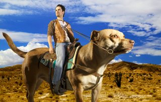
Koudis.com


This composition draws my attention because a human ride on a giant dog. Secondly, the ways use of complementary color like blue orange really makes the picture stand out. The first thing I see is the big dog as a camel. For me this image it's really hilarious because we absolutely know dog is smaller than human. In this case, the dog became an object of transportation like camel. This composition is almost like sci-fi creature which make good for people. It’s so powerful that a dog has the ability to transport human and things. This is really unique idea because we never thought about it. But it’s fun and really works well.